3AM Builds
This isn’t a UI/UX case-study section. It’s where I test interaction design ideas that come to me late at night — gestures, motion and small bits of behavior built as working prototypes.
backward
Faster Transfers
A flow 5M+ people use daily, moving $400M+ a day. I took it from six steps down to three, bringing recipient choice, amount and confirmation into one faster path.
5M+users
$400M+daily volume
~3×faster to complete
Context
Transfers over the Faster Payments System (SBP) are one of the most-used scenarios in the app — and one of the oldest. When I took over the domain, the flow had been running unchanged for years: it didn't remember your last transfer, didn't guide you through anything, just processed whatever you entered the same way, every time. Six separate screens for a single transfer: bank list, amount, review, OTP.
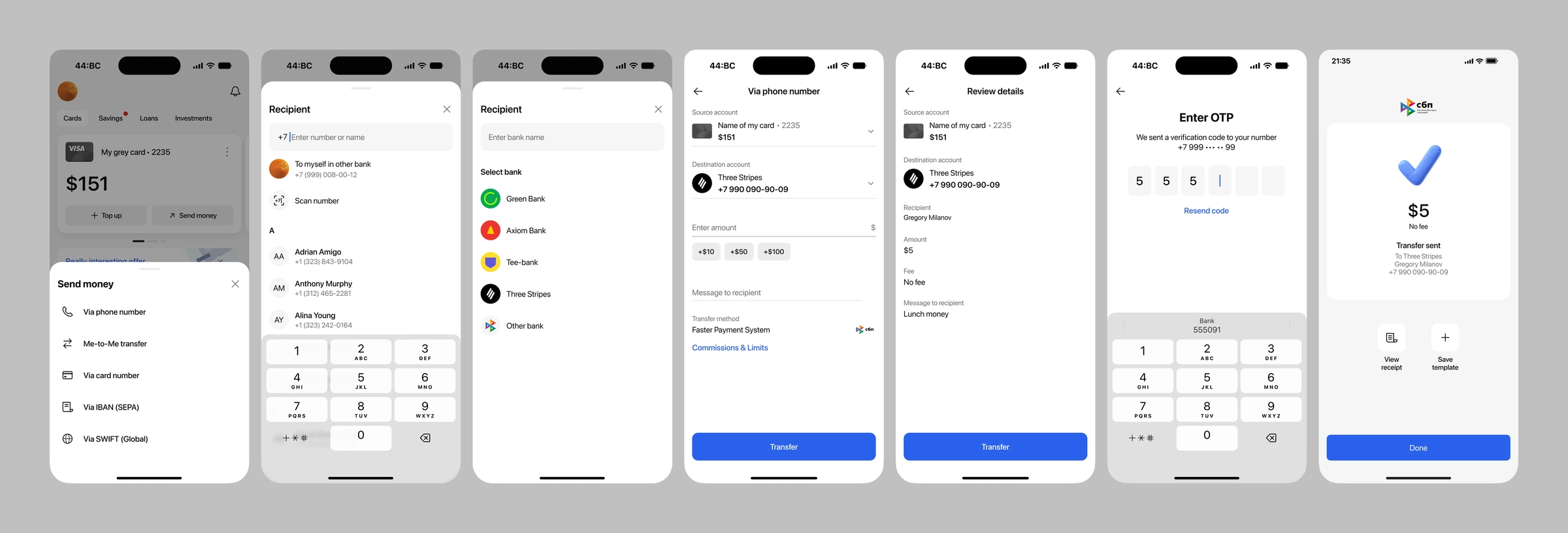
For something millions of people do daily, it should have taken a couple of steps, not six. Other banks had already raised the bar. Staying behind risked losing users to them. Here's what the old flow looked like.
The pushback
The obvious move was a quick fix: one sprint of light tweaks on a flow the business saw as "working fine." I pushed to go deeper and built the case on evidence rather than opinion: funnel analytics, recurring support complaints, a competitive audit, and a round of user interviews all pointed the same way. Stakeholders backed it: the goal was to cut completion time in half without losing usability.
Execution
No custom components, no touching the core. I went after the friction the data pointed to, sat down with analysts and engineers to map what could realistically change, and spent the budget where users actually stumbled, not where the screens looked oldest.
We rolled it out the way we always do for changes at this scale, but with extra caution this time: team dogfooding, then friends & family, then a limited release starting at 0.5% of users, ramping up in smaller steps than usual before reaching 100%.
What shipped
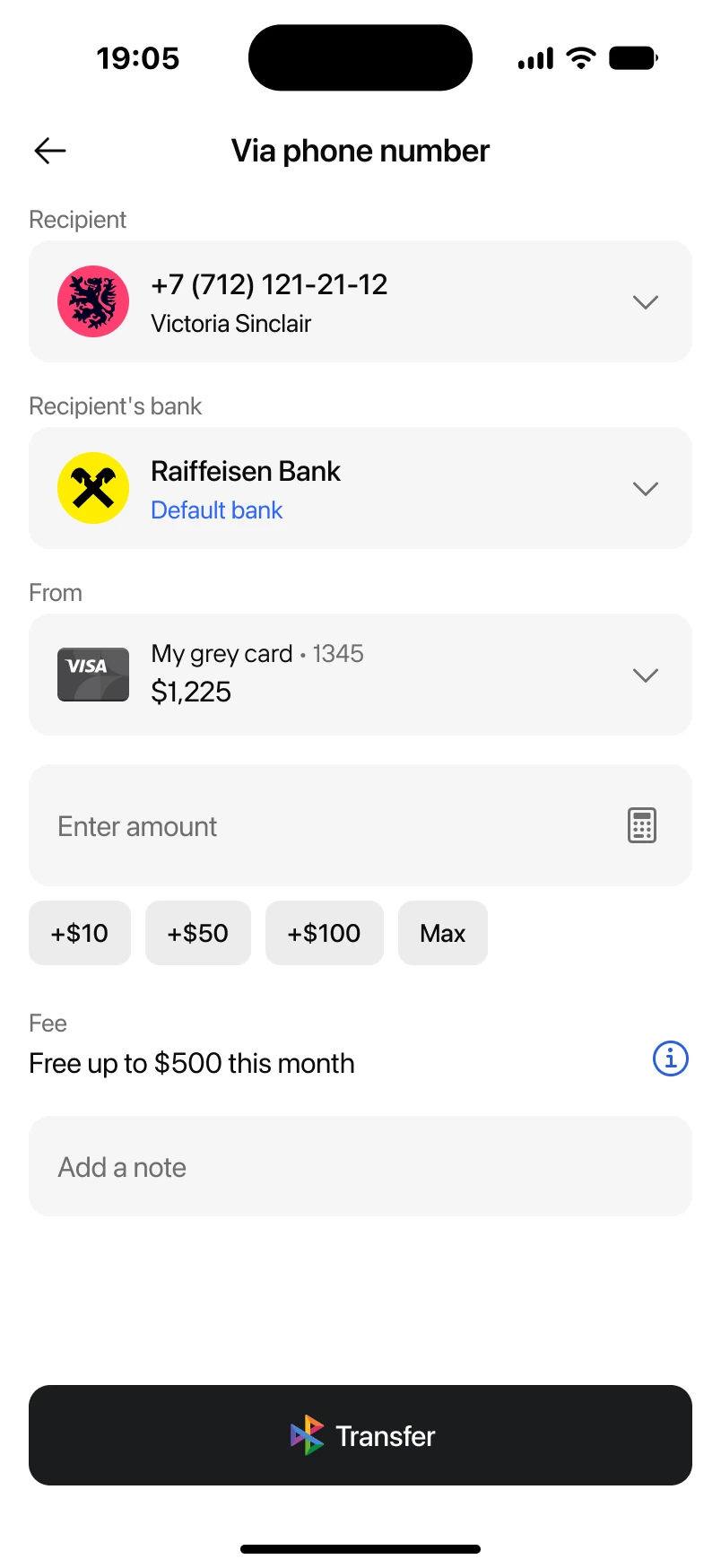
Shorter path: 6 steps → 3. Recipient → amount → done. Three steps disappeared, each for a reason. Bank selection is now automatic: we predict the right bank 96% of the time, either the user's priority bank or the most relevant one based on past transfers to that recipient. The review screen became unnecessary — with every parameter consolidated onto one screen, a separate review step had nothing left to "review." And OTP only kicks in above a threshold. No more waiting on an SMS just to pay a friend back for snacks. A scan option moved right into the recipient field too, for the numbers you'd rather not type.
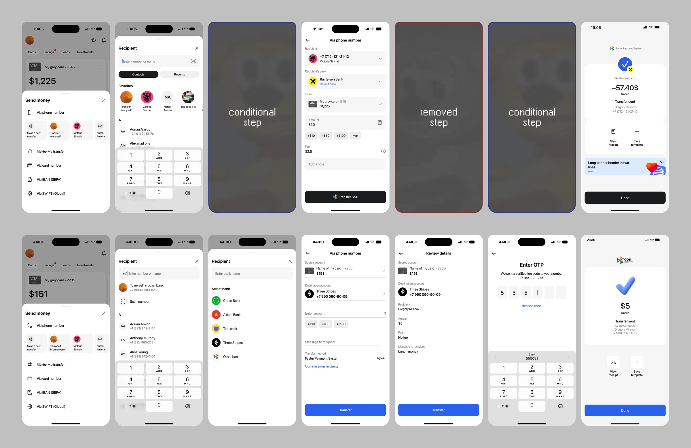
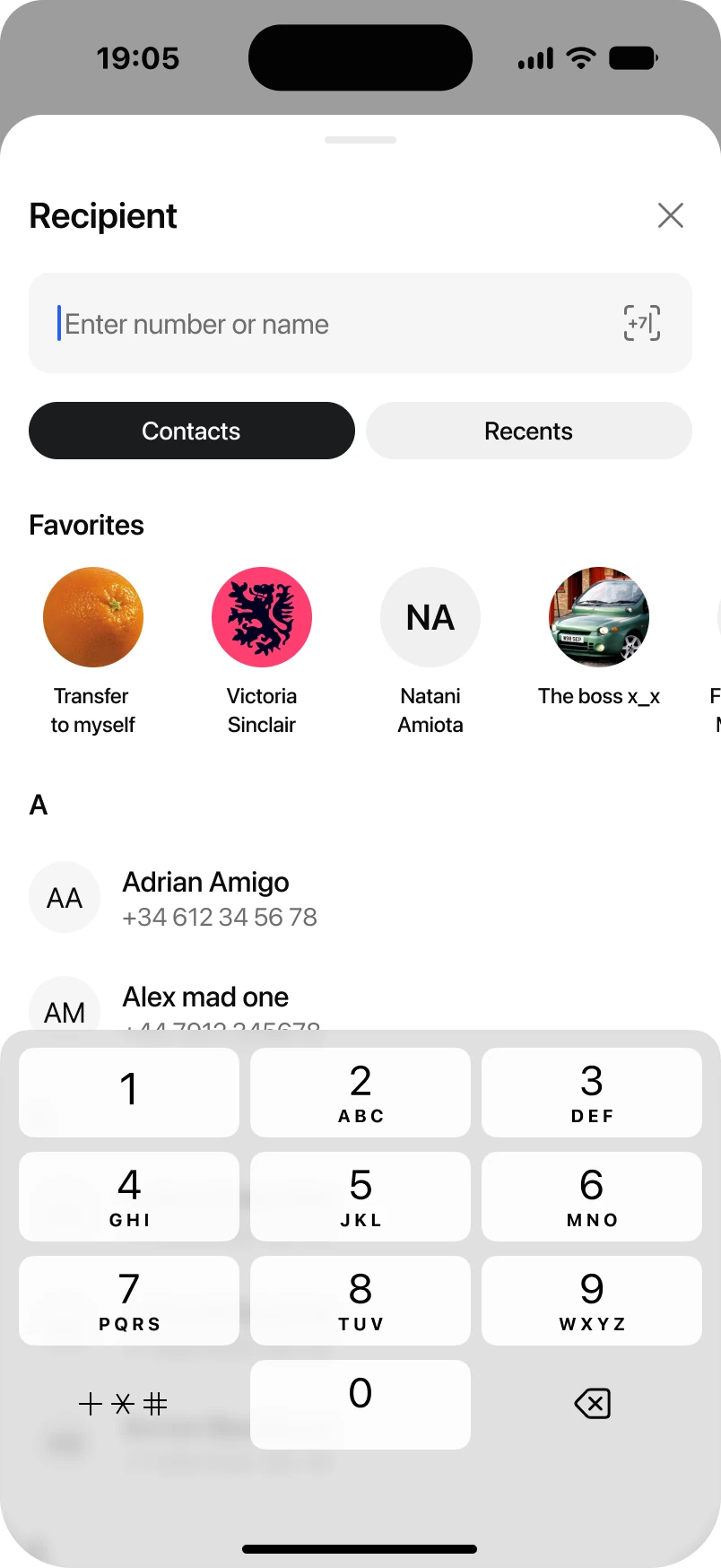
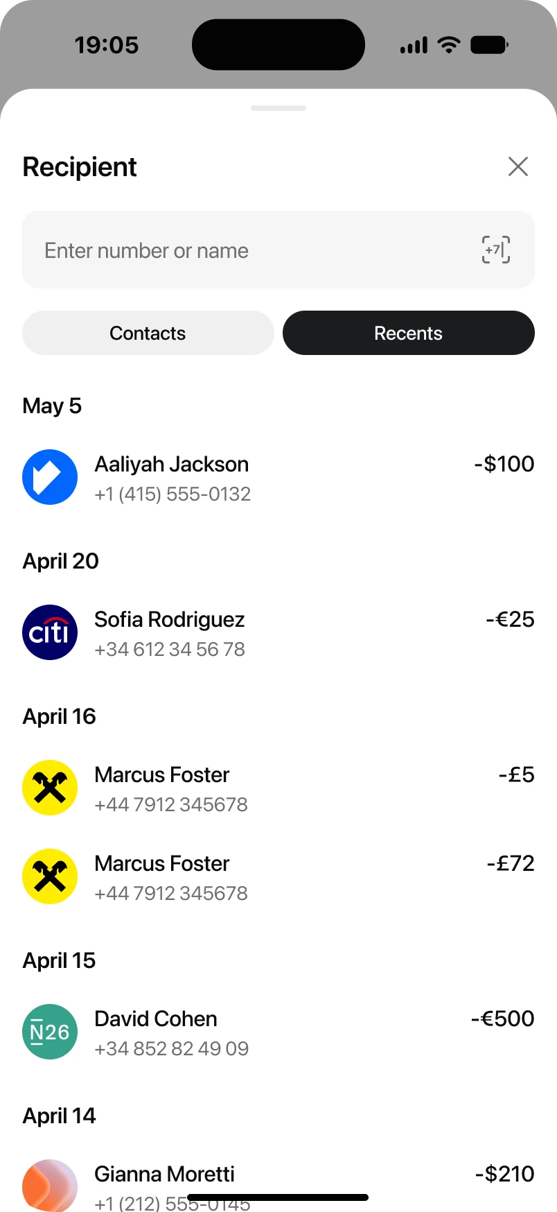
Smarter recipient picking. Picking a recipient got a new option: choose from recent transfers, and the whole thing fills in — recipient, bank, amount — all editable before you confirm. Favorites and relevant contacts now surface right on the screen, in the room that freed up once scanning moved into the recipient field.
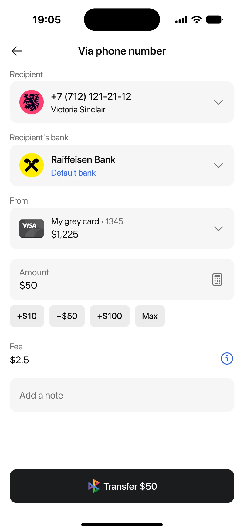
Cost clarity. Fees are calculated live, right on the screen — against the user's actual free-transfer limit, with a counter of what's left. Unexpected costs at the final step are one of the main reasons people abandon a transfer; with nothing left to discover by the time you hit Transfer, drop-off fell. The transfer method used to have its own line in the form, pulling attention it didn't need. Now it's just a compact logo on the Transfer button, and on our market that's already enough for people to recognize SBP.
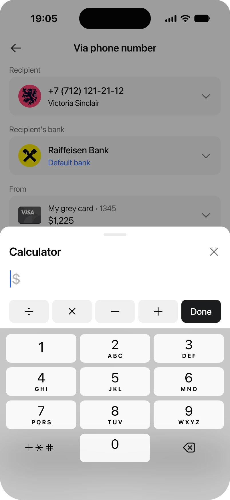
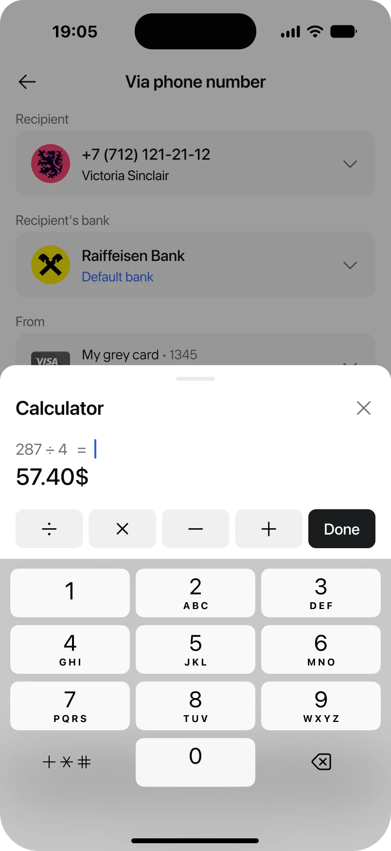
Simpler amount entry. The amount field has a built-in calculator, so splitting a bill doesn't mean leaving the app. We also added a Max chip after noticing feedback from users who wanted to send their whole balance in one tap.
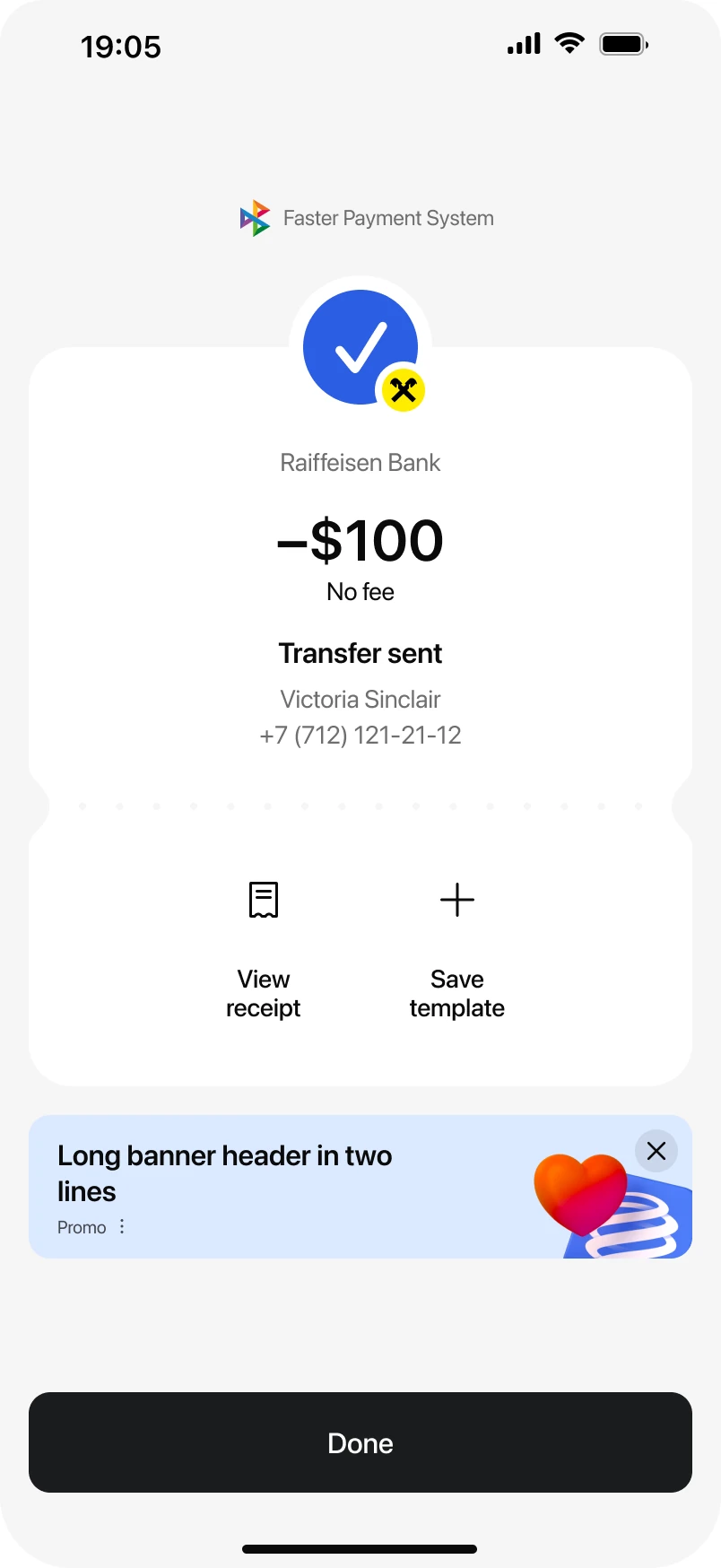
Rebuilt status screen. The outcome of a transfer is now impossible to miss — clear state, clear next step, with room for a timely offer underneath, when there's one worth showing.
The point
We set out to cut completion time in half — we ended up cutting it by three, down to under 30 seconds from the minute and a half it used to take. In follow-up interviews, 19 of 20 participants confirmed it: the new flow was easier to use day to day. Among other things, support tickets about unclear or unexpected fees dropped by a third — fee transparency is a factor a lot of people now weigh when picking a bank.
The domain isn't done: transfers stay the most frequent payment type on our market, and there's another round of improvements already queued up.
backward
Money via QR
Added a new way to receive money and collect it for shared goals. Built with the national payment system operator, as the market's first cross-bank collection on the Faster Payments System (SBP).
$300Kmonthly volume
24Kmonthly top-ups
$12.5avg. check
Context
To receive money, you had to give out your phone number, card, or account details. Either say them out loud or send them in a chat. Collecting from a group was the same problem, just wider: without a faceless credential, everyone chipping in needed those same personal details. That's not always something you want to circulate, and sometimes it just isn't appropriate.
We didn't even have the basic functionality yet, unlike other banks — this part needed building from scratch. They had it, but it only worked well inside a single bank. The moment a sender came from anywhere else, things got complicated. Simply copying what already existed wasn't going to be enough.
The opportunity
To solve this, we partnered with the national payment system operator. Together we worked out the solution: a personal QR on SBP rails, open to senders from any participating bank, with no extra fees on either side.
Beyond the user problem, the business wanted more incoming transfers moving through the bank. My part was building the market's first shared SBP-rails flow for both scenarios, a one-off transfer and a group collection, from the underlying logic through to the screens. I did it solo, with a launch date tied to the country's main fintech forum.
Approach
I led this end to end, from the first sketch to the final screen. Showing up strong at the forum mattered, so there was real pressure to move fast. Add the partner's brand requirements and a stack of technical constraints, and the scope was clear from day one: prioritize the core flows, cut the edge cases. I designed within the existing design system and kept custom visuals to a minimum — on this project, time-to-market was a design requirement.
Validation ran alongside the build, not before it. I looked at markets where QR codes are already the default, both as a personal payment credential and for group collection, and formed hypotheses about the collection mechanic and QR generation. I tested those hypotheses as we went, with a small group of active users. The partner brought their own thesis too, backed by their own quant and qual research, and where it matched what we were seeing, we folded it into the final screens.
What shipped
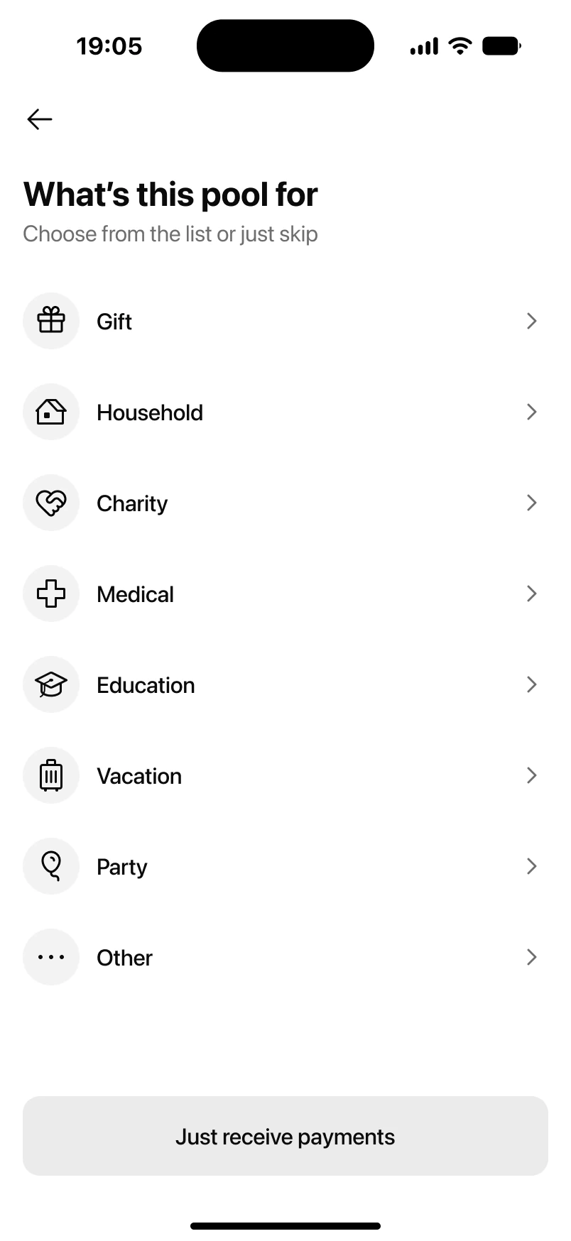
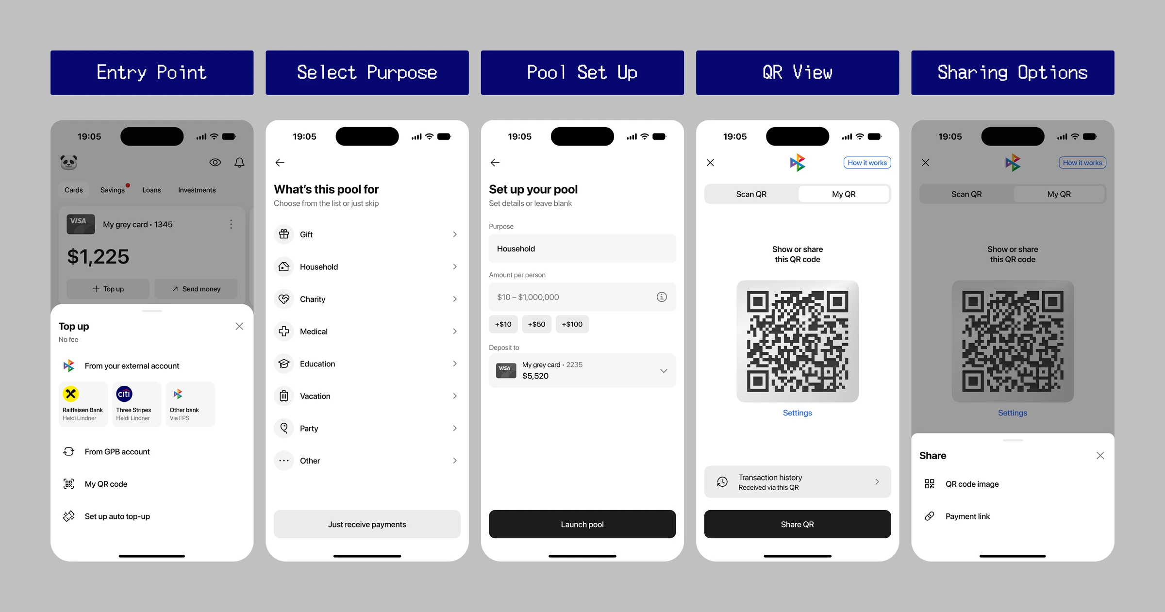
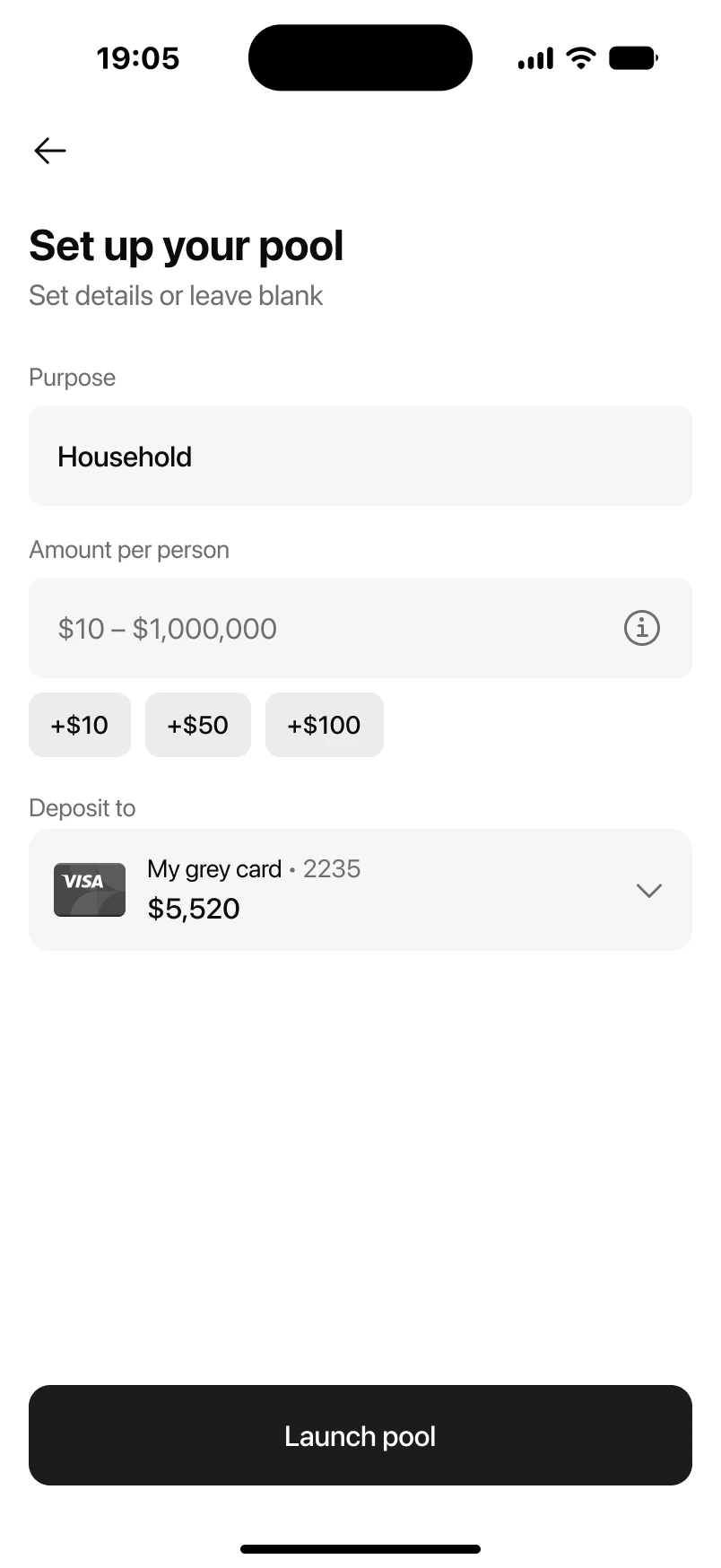
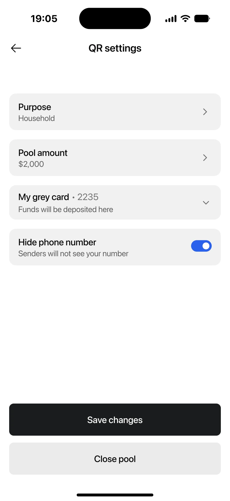
One screen, two jobs. Opening the feature, you choose a goal for a collection, like a gift for a colleague or shared household costs with roommates, or skip straight to Just receive payments and use the QR as your own credential with no set purpose.
A QR you control. Generated once, the QR lives until you reset it. It's a payment credential, and credentials shouldn't change: nobody requests a new card number before every transfer, and a QR code someone saved yesterday should still work today. When you do reset it, the old code stops working immediately. It also keeps your phone number out of the exchange, so you can give it to a stranger without handing over your contact details.
A personal QR has no fixed amount by default, but you can set one if you want to ask for a specific sum. It's the same choice for a collection: when you create it, you decide whether participants owe a fixed amount or the sum stays open, so everyone sends what they can.
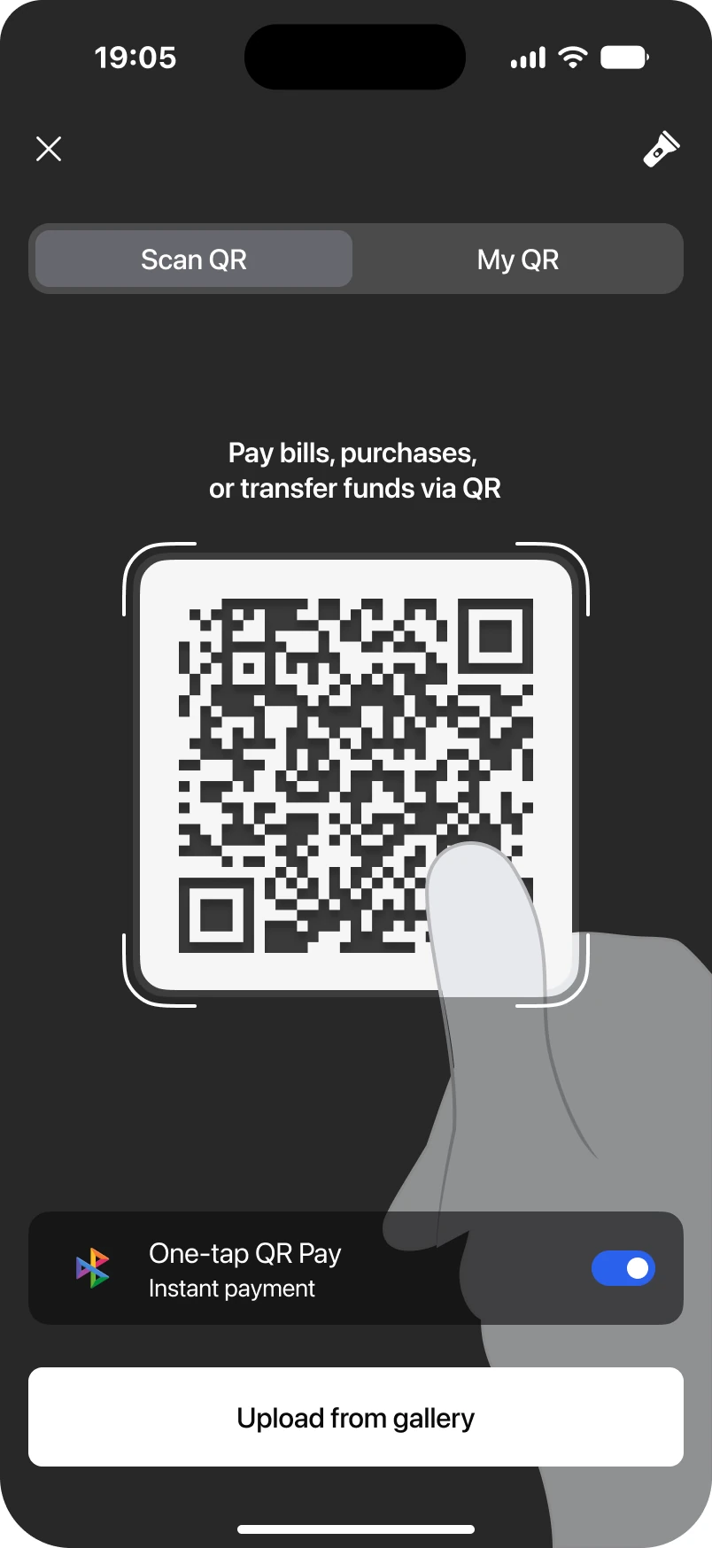
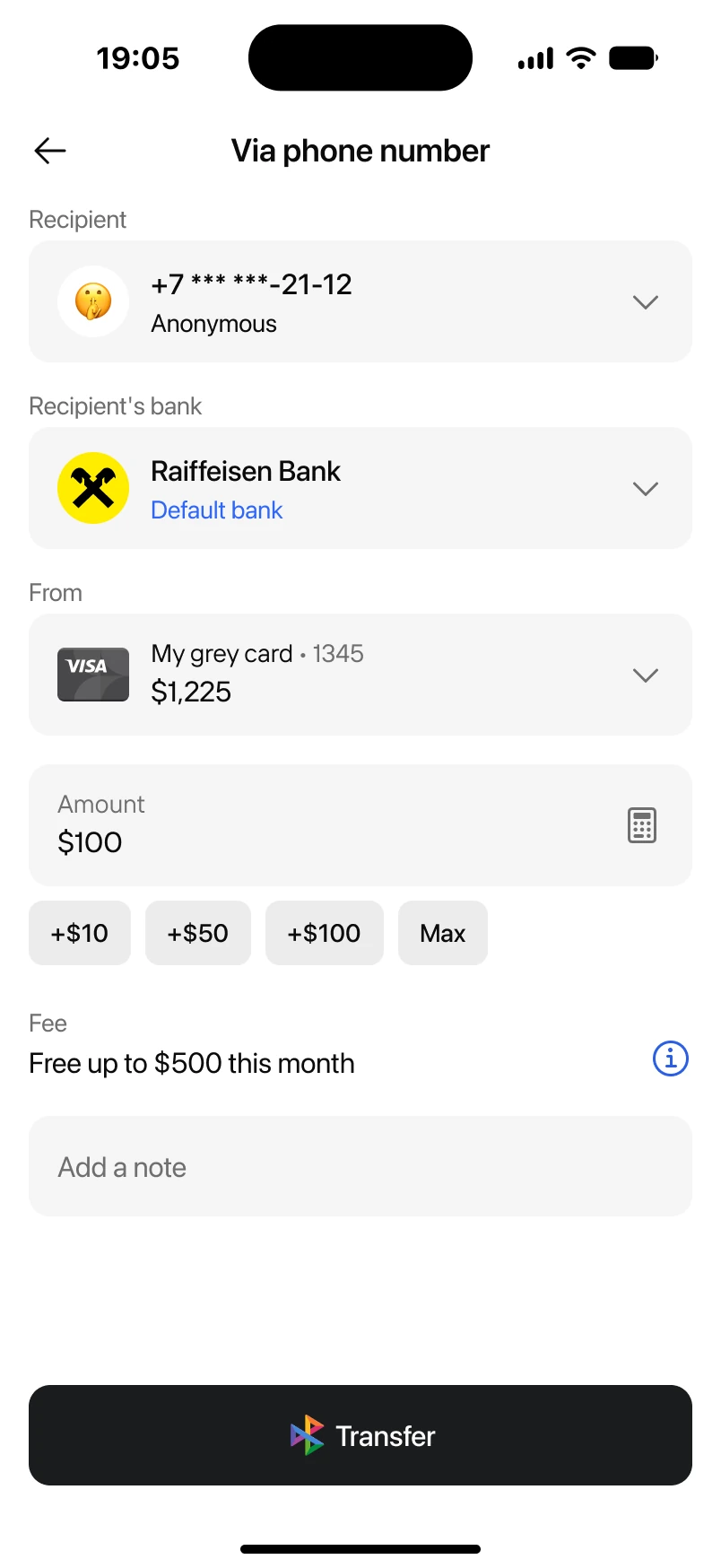
Frictionless for the sender. Scanning with a bank app drops the sender straight into the transfer flow. Scanning with the phone camera opens the partner's routing page, which hands them over to their own bank's app.
Either way, everything arrives pre-filled: the sender sees who they're paying, plus the goal if it's a collection. All that's left is to confirm the amount shown or enter one of their own, then complete the transfer. There's no app to install, no account to create — the sender closes it out without a hitch and doesn't think about it again.
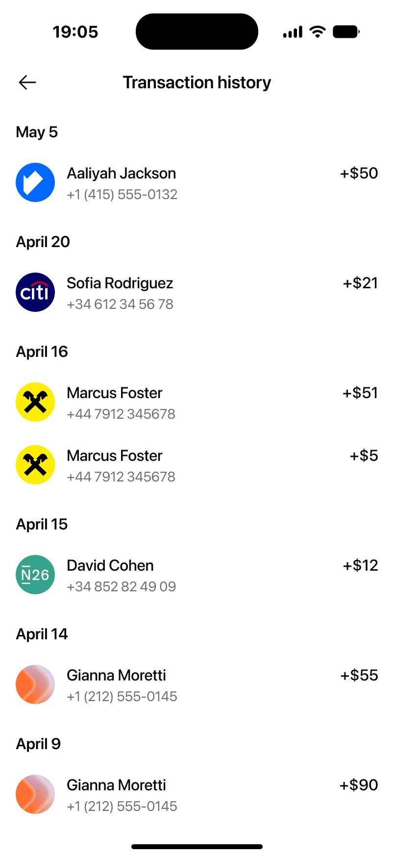
Collection without the chase. Each QR keeps its own transaction history, so the organizer can see who's already sent money and how much, without asking around individually. The organizer side has plenty of room to grow. We shipped the essentials first and left the rest for what's next: more flexible amount settings, like a min-max range instead of one fixed number, inviting people to a collection straight from the app instead of leaving it to a separate share sheet, and a handful of other improvements already on the roadmap.
The point
A QR turned "receiving money" into something you can hand to anyone, any way you like — show it on your phone, send a screenshot, print it out and stick it on the fridge, or, if you're feeling bold, put it on a billboard downtown.
Prototype testing confirmed the direction as we built it. Participants singled out cross-bank collection as the main advantage over what they'd used before, alongside the credential's built-in anonymity and the absence of fees as reasons to trust it.
The launch itself was presented at the fintech forum mentioned earlier, and it landed well with senior figures across the industry.
As expected, expats from QR-first markets picked it up first and fastest, since scanning a code is simply how money moves for them. Other users are coming around more gradually, but once someone starts using it, they keep coming back rather than trying it once and dropping it, and overall adoption is heading in the right direction.
At around $300K in monthly volume, it's still a small share of the transfers business — but the market only has half-measures to compare it to, and this is a genuinely money-focused feature. We expect it to approach $1M a month within about six months, without leaning on heavy promotion to get there. Adoption so far is tracking in that direction. Being first here is a window to become the default before competitors catch up with something equivalent. I think we've built a solid alternative to standard payment details and the groundwork for one of the strongest collection features on the market. There's plenty of work still ahead, and we're pushing it forward. More on that soon.
backward

 network.webm










 Internet zone